.NET MAUI: Let's Play with CollectionView Layouts

In this blog post we will play and see what layout features CollectionView is providing to .NET MAUI developers. CollectionView is a layout/control which we can be useed in order to show some collection of data.
#MAUIUIJuly is back! This post is my entry for .NET MAUI UI July - 2023, #MAUIUIJuly, an initiative by Matt Goldman. Learn more about beautiful .NET MAUI UIs by checking out the other entries too.
In this blog post we will take a look at CollectionView, what are the main features of it, how to use it and what we can accomplish with it.
Introduction
CollectionView it is basically flexible and performant view for presenting lists of data using different layout specifications, we will cover all the layout options in this blog post. Current available layout specifications are:
- Vertical list – a single column list that grows vertically as new items are added.
- Horizontal list – a single row list that grows horizontally as new items are added.
- Vertical grid – a multi-column grid that grows vertically as new items are added.
- Horizontal grid – a multi-row grid that grows horizontally as new items are added.
CollectionView and ListView differences
While the CollectionView and ListView APIs are similar, there are some notable differences:
- CollectionView has a flexible layout model, which allows data to be presented vertically or horizontally, in a list or a grid.
- CollectionView supports single and multiple selection.
- CollectionView has no concept of cells. Instead, a data template is used to define the appearance of each item of data in the list.
- CollectionView automatically utilizes the virtualization provided by the underlying native controls.
- CollectionView reduces the API surface of ListView. Many properties and events from ListView are not present in CollectionView.
- CollectionView does not include built-in separators.
- CollectionView will throw an exception if its
ItemsSourceis updated off the UI thread.
Source: .NET MAUI CollectionView Overview | Microsoft Learn Docs
Our Example app
For this blog post I prepared example app which looks like this:
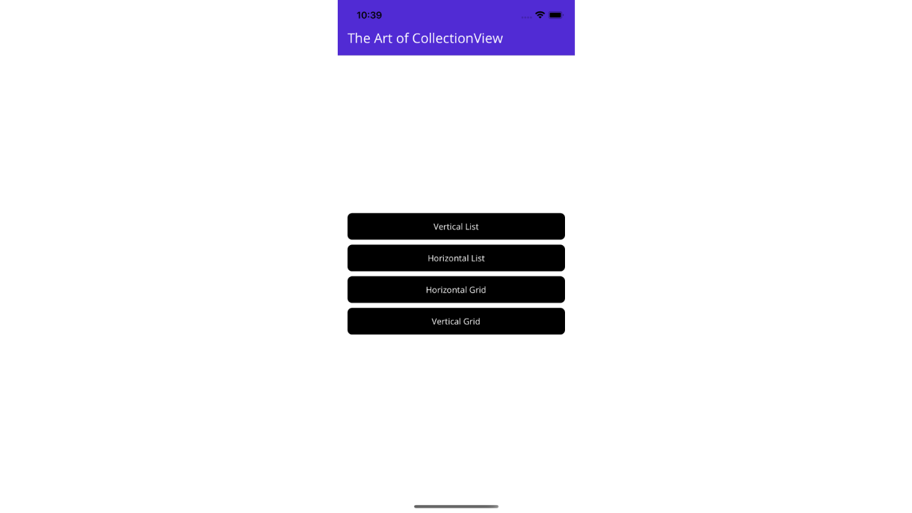
I know, I know... this is the ugliest menu which you can create, but!... I promise the pages and views which you can see till the end of this blog post are more beautiful (or have some kind of non-generic design 😂).
Our app is very simple app with couple of Buttons, each one will navigate to new page with different CollectionView inside of it and CollectionView has different layout usage, so you can easily view each example of them, code for full project is on my GitHub repository here.
So let's start with our play and CollectionView layouts.
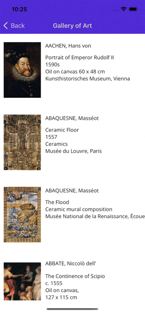
Vertical List
We will start with the default and standard CollectionView behaviour. This is the same behaviour which we would have if we are using standard ListView. This is what you will get using CollectionView without any additional settings and property setup.
The result of this code will be, Vertical (standard) list with items, one image in "0" column and two Label controls in "1" column.
For the data source of this beautiful CollectionView I am using Pictures list which is ObservableCollection stored in my ViewModel (again see the full project on GitHub).
The result of this XAML code looks like this:
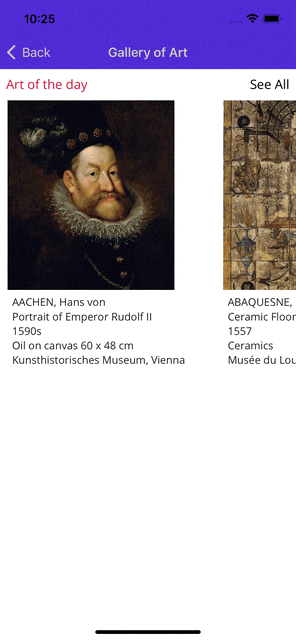
Horizontal List
If you ask me, next really important layout which is available in CollectionView is horizontal scrolling list, it's crazy how easy it is to make horizontal scrolling list with CollectionView in .NET MAUI.
As you can see, the main difference between this horizontal and previous vertical scrolling list is different value for ItemsLayout property and in this case we are using HorizontalList as a value: ItemsLayout="HorizontalList".
If we run our app and navigate to this page, result of horizontal scrolling list it this:
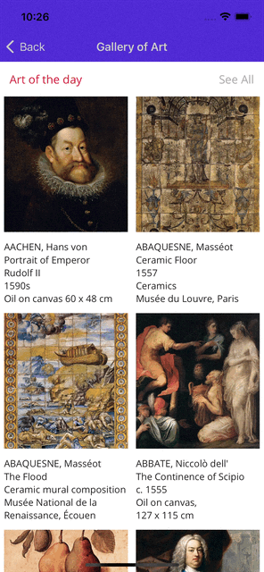
Vertical Grid
How many you in the past had request to create scrolling list with two columns (or more), if you needed to implement it... than you know the pain 😂.. just kidding, but yeah, not having that in Xamarin.Forms (few years ago) it was not an easy task to implement that.
With CollectionView it is really simple to have it done. All we need to do is to use property GridItemsLayout and define how many columns we want to have.
In my example I will use two column vertical scrolling grid with this XAML code:
As you can see; we are using GridItemsLayout with Orientation set to Vertical and Span property represents us the number of columns which our scrolling grid will have, in my case that is two columns so I will set value of two to Span property.
Result of this beautifull code looks like this:
next and our final example is.... 🥁🥁🥁
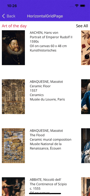
Horizontal Grid
If you carefully read the previous example, you seen that we can choose which Orientation we will use for GridLayout inside of our CollectionView for the this last example we want to have Horizontal scrolling grid with couple of rows and I will use three rows for that.
So we will set Orientation="Horizontal" and Span="3"
And the result of that really simple code change is this one:
.... and that is it. These are four really cool and life saver layouts which we are getting with CollectionView in .NET MAUI.
All the code and project you can find on my GitHub here.
It was fun experience to write blog post again, this was one year break from writing it and I really enjoyed it. Check out other .NET MAUI July entries as well and thank you Matt for making this happend.
As always, I wish you all the best and wishing you lots of luck with coding!
Best regards! 👋